Just a note,

obviously my sentences are lacking in structure and have no grammar and trail off or never finish or pop up in the middle of things BUT this is just a working space for me, not something highly polished :)

Monday, June 8, 2009

Pictures of final set-up minus the actual art work


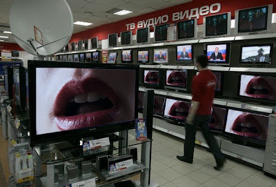
That's it^^^ right there, the technicians come and set up the AV equipment for you before it gets assessed because there aren't enough monitors etc to go around. Imagine those three monitors on top of here with the sound on and the lips etc and thats what it was. Underneath the tablecloth (which was a sheet) are heaps of different words for vagina. You can barely see them so either have to look closer and find the deeper meaning or just ignore them.

Thursday, June 4, 2009

Video Art: Dead or Alive?

Chris, Cynthia. Video Art: Dead or Alive. Afterimage; Nov/Dec 1996, Vol. 24 Issue 3, p4.
ISSN [03007472]


This article proved to be a little bit irrelevant because it was so old although the last one i read was incredible!! This pales in comparison, here's what i did salvage from it;
From what i gather the author thinks that video as a medium peaked in the 1990's and now due to budget cuts and is image as a medium for students and amateurs it is DEAD.
The temptation to cross over from video art to film and earn real money money money drew a lot of artists away from it. Video was seen then (and is now) as lacking in critical legitimacy when compared to film, and almost as a testing ground for artists that want to venture in to film making. Salla Tykka looks to be one of these people (that is a very shallow statement) but she draws on film history using a score reminiscent of Hitchcock, and her films have a kind of narrative, they are constructed and not performances with some sort of narrative.(note on her website 'the F wrod' haha) Her works Zoo and Cave are one of the very few video pieces that i actually sat down and watched, that along with the current exhibition of Yinka Shonibare. I was pissed off to find that his video looped after watching it for ages, i never did see the whole thing :( Video with narrative does not work as well as a reversed loop i feel. I find that if a video work is part of an installation i am less likely to watch it and more likely to give it as much attention as i would a painting. For this reason i decided to show my video works by themselves and not as part of a wider installation.
"Video, it has been noted, is a field in which it is harder than usual to make money"-Martha Rositer, 'Video, sharing the utopian moment'. No shit.
The article then goes on to state that few artists are 'able' to turn their work into something commercial. This lady is missing the point... In the early 90's it was TV culture, that has been replaced by net culture. Net culture is awesome. Anybody can make a video, most people in NZ own or have access to something that can capture footage. That doesn't make video redundant as a medium with this sudden influx of accidental snapshots and film that look good made by aunty Di and Granny Cush.

Hair ideas from ages ago...

Thought i better put these up and discuss them a little bit. I really didn't know what to do with the hair, after bathing in it, eating it, making balls, photographing it, drawing with it, i'm out of ideas. When i arranged them like this i liked that you could see each individually formed ball. The linear format suggested time which i liked because it showed the process of collecting the hair each day. I thought about putting each ball with other items and objects i had cast off that day such as make up removing pads, dirty clothes etc. This would be a lot like Tracey Emin's 1999 work 'My bed' in the way that it would use things just 'as they were' as such just taken ot of context. THis would not convey the message i would like though, i want people to look at the work and be fascinated and drawn to the aestheitc of it as well as feeling uncomfortable and repulsed.Some of them are quite beautiful and sculptural, the way the hair curves and is so three dimensional. It also looks beautiful just stuck to the wall of the shower, very art nouveau with the curves, dark lines and organic shapes. The above image is like some sort of mythical bird or fairy i heart it.

Wednesday, June 3, 2009

Real Bodies: Video in the 1990's

tele- distance

Real Bodies: Video in the 1990's
Art History [0141-6790] Lajer- Burcharth, Ewa. Year 1997 volume 20 pages 185-213

Fantastic article i read online in the database, 29 pages long so i skimmed it but wish i could have read the whole thing!
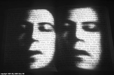
Gary HillI believe it is an image in light of the other (1991-1992)
Video work using images of text and the male body, rotating as if to imitate the turning of pages which can be heard through the audio with the installation. Hill 'defamiliarizes' the body, uses the screen as a mirror. Ok. i took down notes too quickly and now i have no idea what context they were in. Lajer-Burchart mentions Lacan a lot, firstly his idea of " The Real", experiencing ones bod as a remnant or loss, incompleteness of the self under the gaze.
The monitor is a ubiquitous object that structures our experiences and reality of ourselves- how true is this for the majority of the population?

Watching television is like taking black spray paint to your third eye.- Bill hicks

Inasmuch it is always taking place 1990

'You constantly see and thus imagine yourself and the world as a screen image'-pg 190 Lajer- Burcharth, Ewa

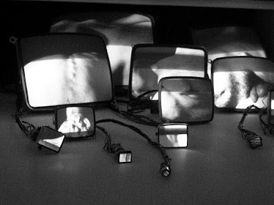
This work features sixteen caseless monitors, why didn't i think of that? Each shows a fragment of his body; foot, torso, chest, back, diddle. By saying diddle did i make it awkward...? These images together create a whole but fragmented body, intimate close ups of skin that barely seem to move creates abstract shapes and textures. In the article his work is described as 'anti- television', it does not tell a story, has no narrative, (it loops) and destructs the television as an object, taking it out of its original frame and letting the artists skin become the screen.

You relocate trust and knowledge of your body to the image on the screen. An example that comes to mind is looking fat in a photo, you're going to believe what the image tells you. Rather than looking down at your physical body you judge yourself based on images of it in photographs and videos because you believe that this is what other people see. By YOU i mean humans collectively and not necessarily everyone or even the person reading this. We think that technology knows us better than we know ourselves, and we put our trust in it. Scales to weigh yourself, personality tests online, the women onscreen having ideal bodies, faces, hair. wan.

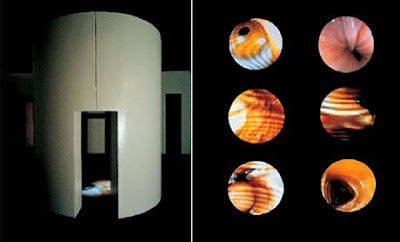
Mona HatoumCorps etranger 1994
This work is my favourite of Hatoum's, it consists of a cylindrical viewing booth with circular projections on the floor of endoscopic views of the inside and outside of her body. Being projected from above you have the option of walking around the image or through it, becoming the screen yourself. She has recorded the sound of her heartbeat and breathing which plays inside the installation. The Real Bodies article describes the work as a sexual threat, vulgar, disturbing and distasteful (awesome :)) The images projected move between interior and exterior views and are all unfamiliar views of the body that are usually excluded from images of the self. These views of the body have been made visually intolerable by dominant cultural representation of the body. We are use to seeing images such as the ones i have made, 'pretty', sexual, feminine. The viewing booth is like when you go to a sex shop and pay $10 to go and have a beat while watching porn. eeew. This is so unlike porn even though it is images of the artists vagina and anus among other things. The extremely close up microscopic views are like medical images so you don't get those erotic connotations of sex, penetration etc.

My work definitely has those sexual connotations. The video of the lips (Edit 1) it very sensual, the dribbling slightly removes it from being purely sexual, making it clumsier and dirty. Mastication of the self is very different to this, more violent, dirtier in a literal sense, more feelings of abjection, disgust. It feels like the lips are now in control, they are still the same lips but have shown that they are not purely a sexual object. The hair being consumed is of the same body as the lips. Both hair and lips are fetishized, revered, beautiful, feminine. This is all subverted when the female is consuming itself. Apart from the fact that nobody would be willing to eat hair for an art project, it is important that the lips belong to me, that it was my idea to 'endure' this act and I'm doing it to myself without (direct) pressure from someone else.
Red Porn is my favourite as i feel it can stand on its own as a video work. It combines the previous two videos in the way that it is still sexual but the more you watch it the more you are repulsed by it. It is something you want to look at but in the same tone feel that you shouldn't be viewing. The image of the lips first came about when trying to imitate screen siren posters with their seductive smiles and inviting pouts. Stills from my footage could be mistaken as a still from a Hollywood film.

Imagined resolutions- photoshop

I put a still of my footage in here, it doesn't look any different to a close up in a movie. As a still image this does nothing! Maybe i should have photoshopped one from the trichophagia clip with the hair in the mouth. I was thinking about putting the video in a more casual setting rather than a gallery situation. I think it could be cool to have it playing on a tiny TV hidden somewhere like in the corner of my desk in this computer room, just hanging out... not trying to be too art and more contented with being a video. Just as a note I like this a crotch-height, i think that would make me feel a bit weird and apprehensive about going near it.
I went in to some businesses on Queen street and left letters with them explaining my artwork and asking if it were possible that i play it on the televisions they have in store. Glassons has a block of nine case-less screens on the wall that build one large image, and Bond and Bond have an arrangement similar to the one shown above. So far they haven't got back to me saying yay or neigh neigh but fingers crossed! I would like to have it playing in there with customers around but i doubt this would be allowed. I would sneakily put it in there and play it but that is a little bit activist and would interfere with the feeling of the work.
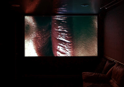
On a big screen projected in the dark...Again it is hard to judge the effect because this is not a moving image. It looks a lot like a cinema in the dark an i think it would need to have some sort of sound with it to fully engage the viewer. I want to get away from a cinematic presentation because this work simply does not compare to a film, it is video for a reason! It is quite confrontational in this setting, you can't get away from it and I don't want it to be like that, i want to leave space for the viewer to imagine things. I found a good post on video art that provoked a lot of discussion, read it here. I have posted the lips videos on youtube, i think this is quite a good setting for them. I labeled the close up one of the lips sideways "Red Porn", not particularly imaginative but I had just watched some Green Porn. I would like to think that people would search porn and get my video as a result and find that all it is is lips. It is quite sexual in a sense but it isn't close to porn at all.
Here is a list of 'related videos' that come up when you watch mine on youtube...
Horny Lesbians having lesbo sex lesbian playtime
Free Big Booty Porn
Masturbating
Girl Fuck Porn
Lego Counterstrike...?
you get the picture.
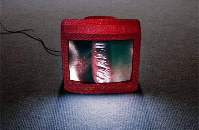
After thinking about presenting the televisions on top of fabric or something i thought i could wrap the TV's in red sequined fabric. I made this in photoshop using a pic of a tv and a pic of the magical fabric. For me this particular fabric connotes to-be-looked-at-i-cant-help-it-but-its-hideous-ness. I want a red sequin TV. I want three.

VIDEO ART
Does it hold anybody's attention? Why do people crowd to watch it at galleries and just walk past paintings? The blog post i mentioned earlier was titled "A Painting is worth a thousand moving images". It takes more time to watch a video, if you don't like a painting you can walk past it, whereas with moving image you want to find out what happens next, humans are very inquisitive. I explored this in an artwork last year that seemed to be just Bars and Tone (that particular version omits the tone for some reason), the tone plays and people would stand there staring at these bars of colour expecting a film to start. The bars and tone just looped continuously. This familiarity with television and film is what drives us to watch it even in a gallery setting. TV is a lazy way of getting information essentially, it's fed to you while you sit there and all you have to do is stare at its carefully calculated stimulating visual images. I have a problem with playing my work on plain televisions because they are just too familiar, they're ugly and they are no longer just screens they are TV.

Tuesday, June 2, 2009

Final installation


I played around a little bit with the arrangement of the monitors, there's not a hell of a lot you can do but it is surprising what difference little adjustments can make to the overall feeling of the work. I would really have loved the Close up video to be played on a larger screen, or projected onto a wall BUT the lighting conditions in the studios do not allow for that. I could put it somewhere with less light but that wouldn't suit either... darkness and that image =seedy yuck.
A huge screen would be great, i looked into hiring one but it didn't quote any prices, i was thinking of getting one of those hanging screens that they use for advertising, it somehow projects from the rear of the screen.. i don't know :(
I've decided to leave the sound of the water running playing with my monitors, mainly to drown out the humming noise made by the crusty broken TV sets. I wish i had a screen with no edges, it looks great played on a mac but i would hate to have that shitty apple logo glaring at people
appleappleappleappleappleappleappleappleappleappleappleappleappleappleappleappleappleappleappleappleappleappleappleappleappleappleapple
which means covering the framing of the monitors with something. THEN you would need a flat surface or some sort of casing surrounding them and it all gets a bit complicated. I have had video works inside little boxes before and it didn't make a huge difference to how they looked it was just a lame formality that i felt i should use.
I really wanted to incorporate the hair i have been collecting into my final work but it doesn't seem to quite fit. I like having the hairballs arranged in a linear format in individual bunches. This could work if the TV monitors were also in a grid like formation but i would rather have them slightly facing each other so that they envelop the viewer.

Sunday, May 31, 2009

Collages and arrangements


Creative Commons License
This work is licensed under a Creative Commons Attribution-Noncommercial-No Derivative Works 3.0 New Zealand License.


I was arranging all of the penfifteen pictures on the wall and wondering what to do with them. The interesting element (for me) is who has drawn them. I arranged them on photoshop just to see if any trends were emerging apart from the obvious fact that boys draw more elaborate and grotesque penises than females do. aaand well thats all i found :) oh and art kids are awesome penis drawers aswell, especially emma catastrophic and her multi tool penis which you can see if you go to the penis blog.
I think i will leave this project to a later date when i have more drawings because there simply aren't enough at the moment :)

Friday, May 29, 2009

RED PORN


Playing around with colour. The original clip was very muted, pastel tones even though a i had bright red lipstick on. I played around with RGB balance and levels to try and make the lips stand out a bit more. Final cut has similar tools to photoshop in this respect so i found it easy to get the look i wanted, although it could be a little less red. I tested the DVD's on a TV earlier and the contrast was ludacris but it turns out it was just that particular TV. phew. A little unhappy with the DVD's, i tried my very best to get them to match up, looping footage and putting similar lip movements at the beginning and end of the dvd's but all of them have a slight glitch.
FCP doesn't like HD footage. I don't like FCP. After watching all the tutorials on the apple website, no, enduring all the tutorials TWICE i still could not burn a dvd, after seeing IT guy he gave me a handout that explained it, missing out 567876 of the steps they tell you to do in the online tutorials. THANK YOU!


Creative Commons License
This work is licensed under a Creative Commons Attribution-Noncommercial-No Derivative Works 3.0 New Zealand License.
this video is a great altered version of the first edit i made. I love that it is essentially the same video it has just been zoomed in and turned around. I put it on youtube, its so moisty and gross like a seacreature. Much like marilyn minter. possibly too much although the display of my work will be vastly different to hers. Hers was situated amongst billboards and advertising, mine will be a little more intimate and less in your face than her work. I feel her work is quite removed from the human body whereas mine looks very visceral but it confuses which body part you are looking at.

Comments from friends
vaginal discharge :)
beautious
im gonna be honest... its a little creepy yea
Wow, cool. Strange, but very cool.
imagine how many yuk ppl will touch their bits watchin that. eeekk
wasnt doing anything untoward, watched with interest mingled with that mixture of disgust and fascination which seems to be appropriate.

Wednesday, May 27, 2009

plans. planes. automobiles. television times three

This is how i want my final installation to look. I made this on google sketchup which is a painful painful program to use. Probably not going to hang a monitor on the wall because i think they are rear projection not flat screen so it would just look silly. I am wondering weather or not to pt things on the table with the monitors, like the hair?? Unsure yet i really need to see what it looks like in the space first to see if it needs anything else...

Tuesday, May 26, 2009

mastication of the self


Creative Commons License
This work is licensed under a Creative Commons Attribution-Noncommercial-No Derivative Works 3.0 New Zealand License.

Chewing hair. love it. loving the dirty dribble, the moistness grossness and the ewww. I've played around with this a bit because it is quite short, i slowed it down and the feeling is totally different, less abjection and repulsion and more fascination. I played it at 20% of the normal speed and the detail in the hair is incredible! Its almost more painful watching it in slow mo, like the mouth doesn't want to eat the hair and is struggling to do so. In the video above the mouth is ravaging it and chomping it in a frenzied manner. I also tried a video where i had portions of it in this jerky motion and parts of it at 20% speed. Not sure if i like it??? I think when played next to the other two videos it would look better to have one in contrast played at high speed. The other two are at pretty much normal frame rate BUT they do not have the hair in the mouth. So maybe playing the hair one at a range of speeds will tie it in more closely with the other two because of the differing subject matter. geeeeezuz. Oh and i cannot for the life of me figure out how to burn a dvd!!! and i can't do any tutorials because i forgot my headphones. poo poo.

Monday, May 25, 2009

Video work

billy apple your website is stupid. and i can't see anything on it apart from a link to email you. I was trying to find the work i had seen in which billifred applehead displays used tissues from nose bleeds he has collected and other items of abjection but to no avail. I remember watching a video about it last year, maybe this year????


Creative Commons License
This work is licensed under a Creative Commons Attribution-Noncommercial-No Derivative Works 3.0 New Zealand License.
First edit of lips. Why the fuck did i not upload this two weeks ago! because you didn't know how and had to sit through tutorials by an american australian man oooh goody my two favourite accents.

Sunday, May 24, 2009

mike hunt

This summary is not available. Please click here to view the post.